import sys

#Project requires Python 3.7 or above
assert sys.version_info >= (3, 7)

# Import libraries
import pandas as pd
import matplotlib.pyplot as plt
from sklearn import metrics
from sklearn.metrics import accuracy_score, confusion_matrix
from sklearn.metrics import ConfusionMatrixDisplay
from sklearn.model_selection import train_test_split
from sklearn.linear_model import LogisticRegressionBackground
This blog post looks at probability within Machine Learning, and how it is used with algorithms like Logistic Regression to analyze data sets. This blog will look at analyzing a voting patterns of two parties in the US Government’s House.
Setup
We will first begin by checking our python version and importing the necessary libraries for this. We will use Pandas to read the csv file and manipulate its data, and matplotlib’s pyplot to display graphs and plot our data. Scikit learn (sklearn) libraries will also be imported for its metrics and models. We will use the metrics to see how accurate the model is and build a confusion matrix. The model libraries will be used to build the Logistic Regression and also split the data.
Data
Let’s start by seeing what our data looks like.
# Read data
data = pd.read_csv("house_votes.csv")
data.head()| Class Name | handicapped-infants | water-project-cost-sharing | adoption-of-the-budget-resolution | physician-fee-freeze | el-salvador-aid | religious-groups-in-schools | anti-satellite-test-ban | aid-to-nicaraguan-contras | mx-missile | immigration | synfuels-corporation-cutback | education-spending | superfund-right-to-sue | crime | duty-free-exports | export-administration-act-south-africa | |
|---|---|---|---|---|---|---|---|---|---|---|---|---|---|---|---|---|---|
| 0 | republican | n | y | n | y | y | y | n | n | n | y | ? | y | y | y | n | y |
| 1 | republican | n | y | n | y | y | y | n | n | n | n | n | y | y | y | n | ? |
| 2 | democrat | ? | y | y | ? | y | y | n | n | n | n | y | n | y | y | n | n |
| 3 | democrat | n | y | y | n | ? | y | n | n | n | n | y | n | y | n | n | y |
| 4 | democrat | y | y | y | n | y | y | n | n | n | n | y | ? | y | y | y | y |
The dimensions of the data is (435, 17). There were 16 different issues for which voting in the House of Representatives was conducted, and 435 representatives voted. However, in the data set we can see some votes listed as ‘?’. This indicates that a vote was not given. We can now see how the data is structured and the way votes were provided.
Plotting the Data
Let’s plot the data to visualize what the distributions look like and see if we can draw any initial inferences from what we see.
First, let’s look at what the voting distribution actually looked like. While we have all the votes, it is difficult to see how many votes for yes/no/? were actually recevied in each category. Let’s first create a table to display this information.
# Display data distribution
df = pd.DataFrame([], columns=['Yes', 'No', "?"])
for col in data.columns[1:]: # '1:' to skip first column (Class Name)
    vals = []
    yes = data[col].value_counts()['y']
    no = data[col].value_counts()['n']
    na = data[col].value_counts()['?']

    vals.append(yes)
    vals.append(no)
    vals.append(na)

    df.loc[col] = vals

#Visualize df vote distribution
df| Yes | No | ? | |
|---|---|---|---|
| handicapped-infants | 187 | 236 | 12 |
| water-project-cost-sharing | 195 | 192 | 48 |
| adoption-of-the-budget-resolution | 253 | 171 | 11 |
| physician-fee-freeze | 177 | 247 | 11 |
| el-salvador-aid | 212 | 208 | 15 |
| religious-groups-in-schools | 272 | 152 | 11 |
| anti-satellite-test-ban | 239 | 182 | 14 |
| aid-to-nicaraguan-contras | 242 | 178 | 15 |
| mx-missile | 207 | 206 | 22 |
| immigration | 216 | 212 | 7 |
| synfuels-corporation-cutback | 150 | 264 | 21 |
| education-spending | 171 | 233 | 31 |
| superfund-right-to-sue | 209 | 201 | 25 |
| crime | 248 | 170 | 17 |
| duty-free-exports | 174 | 233 | 28 |
| export-administration-act-south-africa | 269 | 62 | 104 |
This is better to look at the overall voting spread of each category. After a first glance, it appears that most category had more ‘yes’ votes, indicating that in favor of the bill or issue passed was more likely.
Let’s display this on a stacked bar graph to see how the spread looks on a plot. We will also store the vote result in a list. This will be used later when we want to compare the winners. The list will be in left to right order of the categories provided.
# Plot data on stacked bar graph
df.plot.bar(stacked=True)
win_vote = ['No', 'Yes', 'Yes', 'No', 'Yes', 'Yes', 'Yes', 'Yes', 'Yes', 'Yes', 'No', 'No', 'Yes', 'Yes', 'No', 'Yes']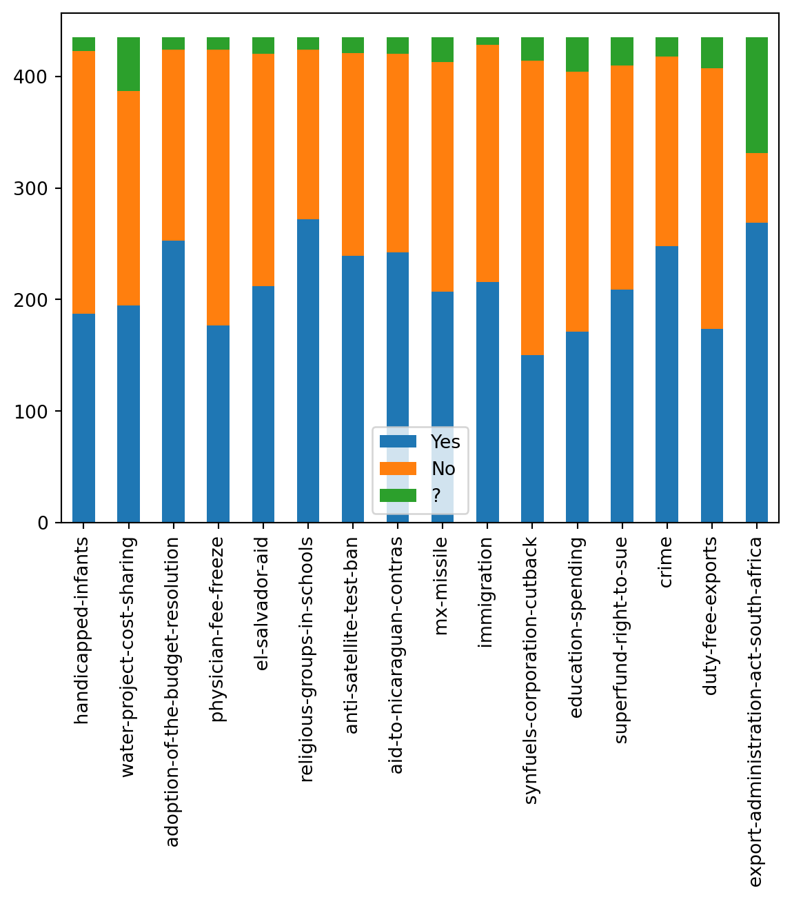
Let’s look at party specific data now. We know that two parties, the Republicans and Democrats, were present in voting. Let’s see how many members from each party are present.
# Look at party specific data, who voted yes/no in each category
print("Republicans: ", data['Class Name'].value_counts()['republican'])
print("Democrats: ", data['Class Name'].value_counts()['democrat'])

labels = ['Republicans', 'Democrats']
plt.pie(data['Class Name'].value_counts(), labels=labels, autopct='%1.0f%%')
plt.show()
Republicans: 168
Democrats: 267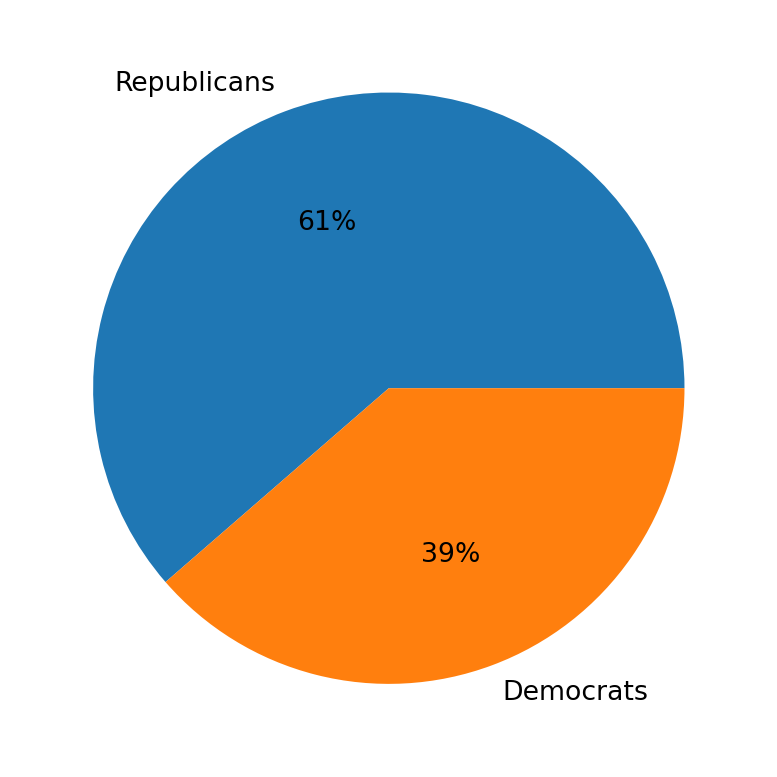
There are more Democrats present than Republicans. This is important information as it could indicate one party had stronger voting power, which may have played a role in which party got its favored outcome for each bill passed.
Let’s take each issue, and split it amongst the voting distribution for both parties. We can look at this and see which party got the favorable outcome. This will be done using the pivot table method which will build the table per each column against the Class Name. We will also use the win_votes list to add to the table as we go through the columns.
# Find number of wins for each voting issue per party
df2 = pd.DataFrame(data)
i = 0 # Go through winning votes
for col in data.columns[1:]: # 1: Skips class name
    table = df2.pivot_table(index='Class Name', columns=col, aggfunc='size', fill_value=0)
    table['Winning Vote'] = win_vote[i]
    table.at['republican', 'Winning Vote'] = 'NA' #Format, remove from last
    display(table)
i = i + 1| handicapped-infants | ? | n | y | Winning Vote |
|---|---|---|---|---|
| Class Name | ||||
| democrat | 9 | 102 | 156 | No |
| republican | 3 | 134 | 31 | NA |
| water-project-cost-sharing | ? | n | y | Winning Vote |
|---|---|---|---|---|
| Class Name | ||||
| democrat | 28 | 119 | 120 | Yes |
| republican | 20 | 73 | 75 | NA |
| adoption-of-the-budget-resolution | ? | n | y | Winning Vote |
|---|---|---|---|---|
| Class Name | ||||
| democrat | 7 | 29 | 231 | Yes |
| republican | 4 | 142 | 22 | NA |
| physician-fee-freeze | ? | n | y | Winning Vote |
|---|---|---|---|---|
| Class Name | ||||
| democrat | 8 | 245 | 14 | No |
| republican | 3 | 2 | 163 | NA |
| el-salvador-aid | ? | n | y | Winning Vote |
|---|---|---|---|---|
| Class Name | ||||
| democrat | 12 | 200 | 55 | Yes |
| republican | 3 | 8 | 157 | NA |
| religious-groups-in-schools | ? | n | y | Winning Vote |
|---|---|---|---|---|
| Class Name | ||||
| democrat | 9 | 135 | 123 | Yes |
| republican | 2 | 17 | 149 | NA |
| anti-satellite-test-ban | ? | n | y | Winning Vote |
|---|---|---|---|---|
| Class Name | ||||
| democrat | 8 | 59 | 200 | Yes |
| republican | 6 | 123 | 39 | NA |
| aid-to-nicaraguan-contras | ? | n | y | Winning Vote |
|---|---|---|---|---|
| Class Name | ||||
| democrat | 4 | 45 | 218 | Yes |
| republican | 11 | 133 | 24 | NA |
| mx-missile | ? | n | y | Winning Vote |
|---|---|---|---|---|
| Class Name | ||||
| democrat | 19 | 60 | 188 | Yes |
| republican | 3 | 146 | 19 | NA |
| immigration | ? | n | y | Winning Vote |
|---|---|---|---|---|
| Class Name | ||||
| democrat | 4 | 139 | 124 | Yes |
| republican | 3 | 73 | 92 | NA |
| synfuels-corporation-cutback | ? | n | y | Winning Vote |
|---|---|---|---|---|
| Class Name | ||||
| democrat | 12 | 126 | 129 | No |
| republican | 9 | 138 | 21 | NA |
| education-spending | ? | n | y | Winning Vote |
|---|---|---|---|---|
| Class Name | ||||
| democrat | 18 | 213 | 36 | No |
| republican | 13 | 20 | 135 | NA |
| superfund-right-to-sue | ? | n | y | Winning Vote |
|---|---|---|---|---|
| Class Name | ||||
| democrat | 15 | 179 | 73 | Yes |
| republican | 10 | 22 | 136 | NA |
| crime | ? | n | y | Winning Vote |
|---|---|---|---|---|
| Class Name | ||||
| democrat | 10 | 167 | 90 | Yes |
| republican | 7 | 3 | 158 | NA |
| duty-free-exports | ? | n | y | Winning Vote |
|---|---|---|---|---|
| Class Name | ||||
| democrat | 16 | 91 | 160 | No |
| republican | 12 | 142 | 14 | NA |
| export-administration-act-south-africa | ? | n | y | Winning Vote |
|---|---|---|---|---|
| Class Name | ||||
| democrat | 82 | 12 | 173 | Yes |
| republican | 22 | 50 | 96 | NA |
From all the tables, we can see that democrats voting was generally much stronger, but partially also because there were more members of that party present. Most bills were voted in favor of (yes), and generally Democrats were more likely to get the favorable outcome.
Prepare The Data
Now that we know what to expect from our analysis and how our data spread is structured, we can prepare the data set for the model.
Since the data comes in yes/no format, we will need to convert this to numerical values so our Logistic Regression can work with the data. We will map ‘republican’ to 1 and ‘democrat’ to 0. Similarly for the data, we will map ‘yes’ to 1 and ‘no’ to 0. Since we do not want to count ‘?’ votes towards any single party, we will mark those votes with a value of 0.5, a neutral point.
# Prep data for Logistic Regression
X = data.copy()
X['Class Name'] = X['Class Name'].map({'republican':1, 'democrat':0})

for col in X.columns.drop('Class Name'):
    X[col] = X[col].map(
                   {'y':1 ,'n':0, '?':0.5})

print(display(X.head()))| Class Name | handicapped-infants | water-project-cost-sharing | adoption-of-the-budget-resolution | physician-fee-freeze | el-salvador-aid | religious-groups-in-schools | anti-satellite-test-ban | aid-to-nicaraguan-contras | mx-missile | immigration | synfuels-corporation-cutback | education-spending | superfund-right-to-sue | crime | duty-free-exports | export-administration-act-south-africa | |
|---|---|---|---|---|---|---|---|---|---|---|---|---|---|---|---|---|---|
| 0 | 1 | 0.0 | 1.0 | 0.0 | 1.0 | 1.0 | 1.0 | 0.0 | 0.0 | 0.0 | 1.0 | 0.5 | 1.0 | 1.0 | 1.0 | 0.0 | 1.0 |
| 1 | 1 | 0.0 | 1.0 | 0.0 | 1.0 | 1.0 | 1.0 | 0.0 | 0.0 | 0.0 | 0.0 | 0.0 | 1.0 | 1.0 | 1.0 | 0.0 | 0.5 |
| 2 | 0 | 0.5 | 1.0 | 1.0 | 0.5 | 1.0 | 1.0 | 0.0 | 0.0 | 0.0 | 0.0 | 1.0 | 0.0 | 1.0 | 1.0 | 0.0 | 0.0 |
| 3 | 0 | 0.0 | 1.0 | 1.0 | 0.0 | 0.5 | 1.0 | 0.0 | 0.0 | 0.0 | 0.0 | 1.0 | 0.0 | 1.0 | 0.0 | 0.0 | 1.0 |
| 4 | 0 | 1.0 | 1.0 | 1.0 | 0.0 | 1.0 | 1.0 | 0.0 | 0.0 | 0.0 | 0.0 | 1.0 | 0.5 | 1.0 | 1.0 | 1.0 | 1.0 |
NoneLogistic Regression
First, the data will be split into training and testing sets, so we have can compare how well our model works after training it on the train set.
# Split data set into train and test sets, use standard 80-20 split
X_train, X_test, Y_train, Y_test = train_test_split(X.drop('Class Name',axis=1), X['Class Name'], train_size=0.8, test_size=0.2)
We will then build the Logistic Regression model. Since this model applies the Maximum Likelihood method, it is very powerful for calculating probabilities. It essentially will use these to figure out how to classify the data. This model will take the data and determine which party the individual belongs to based on their voting data. We will fit the data and then create a prediction list.
# Split data set into train and test sets, use standard 80-20 split
X_train, X_test, Y_train, Y_test = train_test_split(X.drop('Class Name',axis=1), X['Class Name'], train_size=0.8, test_size=0.2)

# Logistic Regression
log = LogisticRegression()
log.fit(X_train, Y_train)
predict = log.predict(X_test)
Let’s check how well our model works by finding its accuracy score. We will compare the predict set to the test set.
score = accuracy_score(Y_test, predict)
print(score)0.9885057471264368The model performs very well to this data set and has good accuracy. Over 90% accuracy means this Logistic Regression model fits the data set very strongly.
Additional Analysis - Confusion Matrix
To better understand how our model classified the data and its overall accuracy, we will look at a confusion matrix. This will show how many predictions are correct and incorrect, essentially giving us the prediction summary. It will provide data on the True Negatives, False Positives, False Negatives, and True Positives.
confusion = confusion_matrix(Y_test, predict)
confusion
array([[44, 1],
[ 0, 42]])This is the output array. Let’s graph this to visualize it better, for which we can use the ConfusionMatrixDisplay.
# Show confusion matrix on plot
cm_display = ConfusionMatrixDisplay(confusion_matrix = confusion, display_labels = [False, True])
cm_display.plot()
<sklearn.metrics._plot.confusion_matrix.ConfusionMatrixDisplay at 0x124eda510>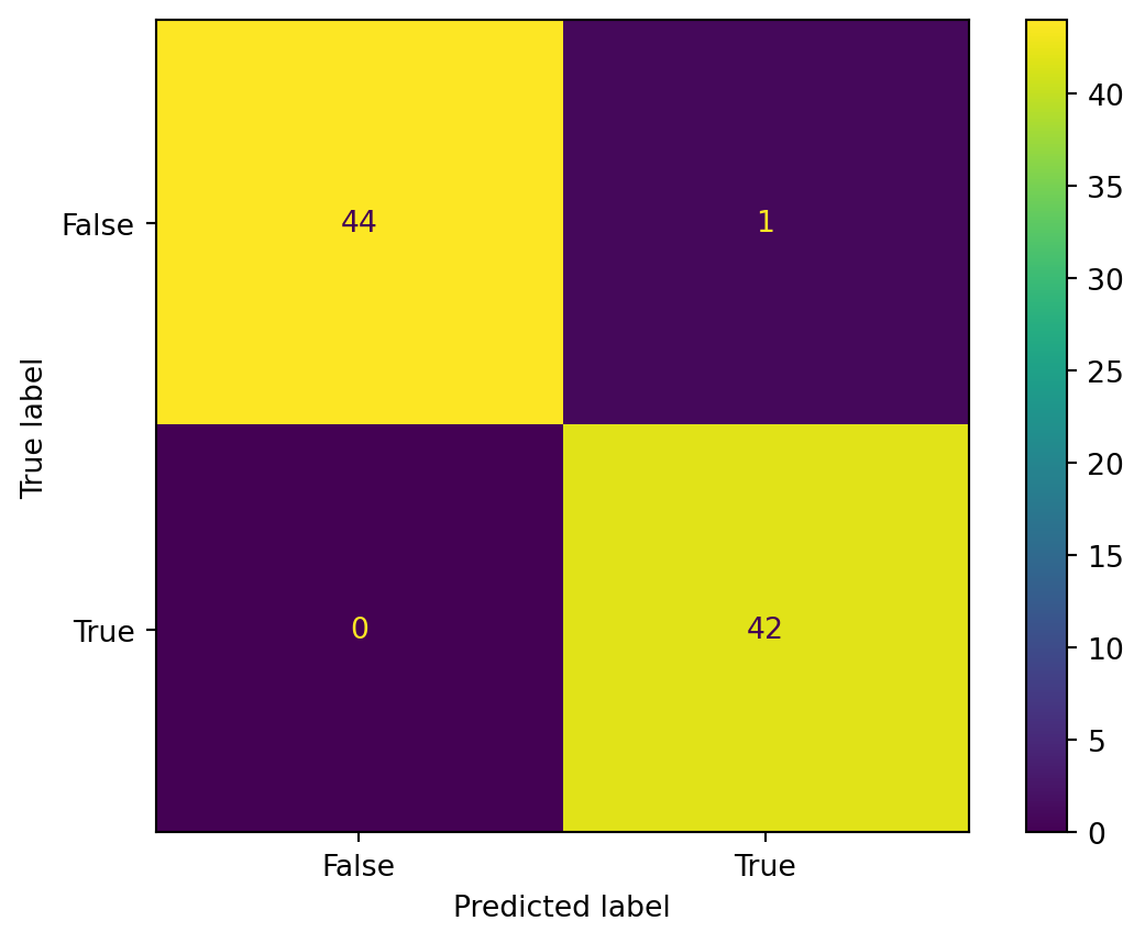
This lets us visualize how the Confusion matrix appears.